User Research
RESEARCH METHODS & FINDINGS
We started our user research with a Google Survey form, which we spread throughout social media and school forums. Our target audience was young adults with ages ranging from 16-34, since Uber reports that adolescents and young adults in the U.S. age 16 to 34 make up 65% of their total users.
CORE FINDINGS
01
Passengers are put into awkward and unpleasant riding situations in which the driver is too talkative.
02
Passengers are unable to express their preferences for conversational habits before entering the vehicle.

User Personas
We created two different types of users that have contrasting preferences for the ideal Uber ride experience. These personas encompass our target audience, and provide two very different needs that the feature can cater towards.


User Flows
To cater to both of the personas, we started off by designing two different user flows. We wanted to insert an extra step during the car-booking process in which the user could input his conversational preferences so that the right driver could be sent for the ride.

User FLOW 01 caters to personas that match people like Rosie and Clyde, because riders are able to specify their preferences right before entering the vehicle. This prevents any awkward interactions with the driver and avoids any conflict-of-interests between the driver and the user. This solution is ideal for both outgoing and shy personalities that do not enjoy confrontation. Since users are able to choose their preference each time, they can also customize what they want depending on their moods.
User FLOW 02 caters to personas that match people more like Rosie, because it offers a more permanent preference option. Instead of requesting user input for conversation levels before each ride, this flow allows riders to input their preferences for every ride through User Settings. This is helpful for independent travelers that consistently want no conversation during their trips and is more likely to be used by people who know what they want from every ride.

Low Fidelity Prototypes
Using these two user flows, we created a series of paper prototypes and conducted more user testing in order to determine which flow would be more effective for our target audience.
Our different iterations for each UI sketch allowed us to map out several ways the Uber application could be navigated. Each method to achieve our goal of strategically incorporating the ‘Conversation Preference’ before each trip also made us note which UX flow best fits different users. We conducted more interviews in order to determine which flow was more popular amongst users, and we also discovered useful feedback and made some new key findings.
PROTOTYPE A
- Better for users with changing moods (sometimes want to get to know their driver, sometimes prefer silence).
- Works best for ride-to-ride customization. Some users want to be able to adjust their preferences during the ride however, to accommodate for how they feel about the driver they are actually given.
- Adjusting preferences before each trip could be time-consuming and pressuring.
PROTOTYPE B
- Better for users with consistent preferences and want the same ride experience each time. Offers a more permanent solution, though less flexible.
- If the customization option is kept in the settings, users may skip this step and never change their preferences.
- This version will keep the ride booking process shorter without adding an extra step.
High Fidelity Prototypes
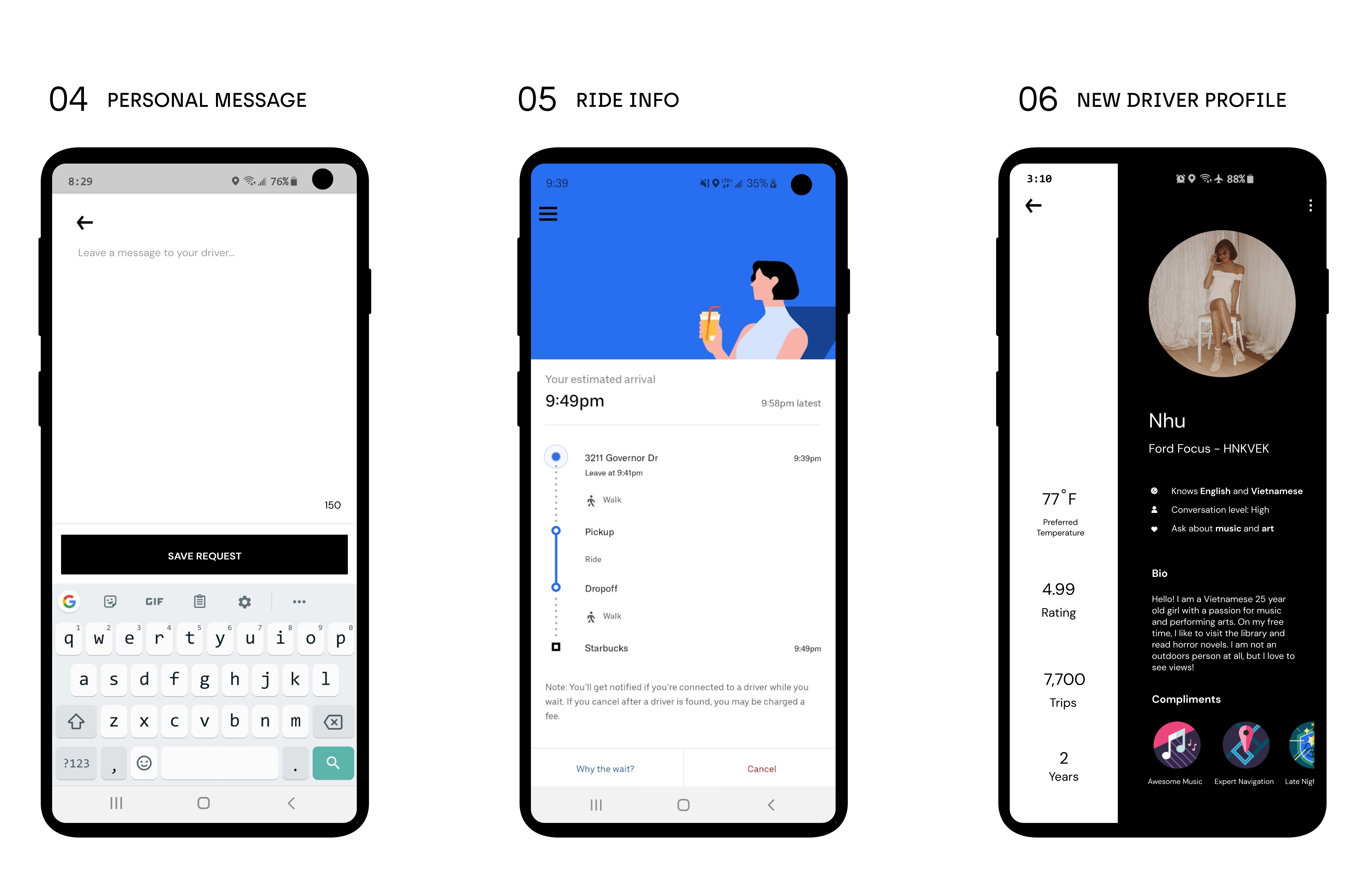
Our high-fidelity prototype emulates a new redesign feature that allows users to take control of their Uber ride experience. Before booking each ride, riders will be able to select their preferred conversation level, temperature level, and any additional information that the driver needs to know.


Before-And-After Stories
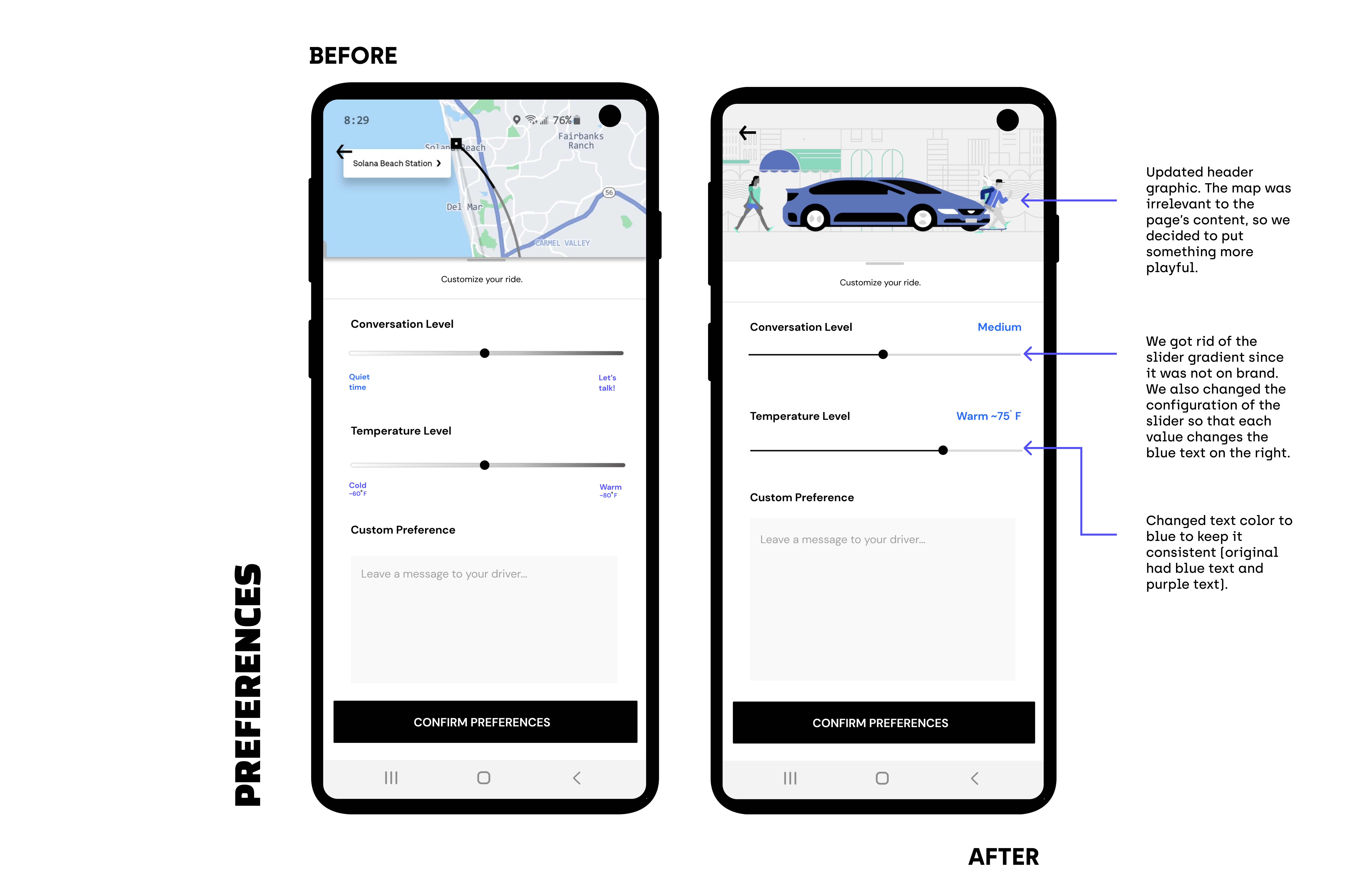
The two screens we added or improved in our redesign were screens 03 (customize ride preferences) and 07 (driver profile), so we focused on heavily user-testing these two steps. Below are the changes we decided to implement after user interviews.


Final Reflection
This project really forced me to see the importance of each step of the redesign process. I was able to practice my UX research skills by conducting user interviews and seeing the value in paper prototypes. I also enjoyed the challenge of following the brand's guidelines and coming up with interesting ways to layout text-heavy information.