SLACK
Overview
PRODUCT DESIGN INTERN
-
prototyping
interaction design
user research
Overview
Slack is a powerful communication platform that is increasingly replacing email and is an essential tool for thousands of companies during the incoming age of remote online work. As of October 2019, Slack has 20 million daily active users, and has been growing exponentially as the mobile and desktop experiences are undergoing whole redesigns.
My Role
As a product design intern, I worked closely with my mentor and product design leadership to define the details of the features I was working on. I created design flows, prototypes, sketches, and high-fidelity prototypes for these features. I also collaborated with engineering, research, and product management to ensure a high-quality implementation and to ship a polished user experience.

PROBLEM STATEMENT
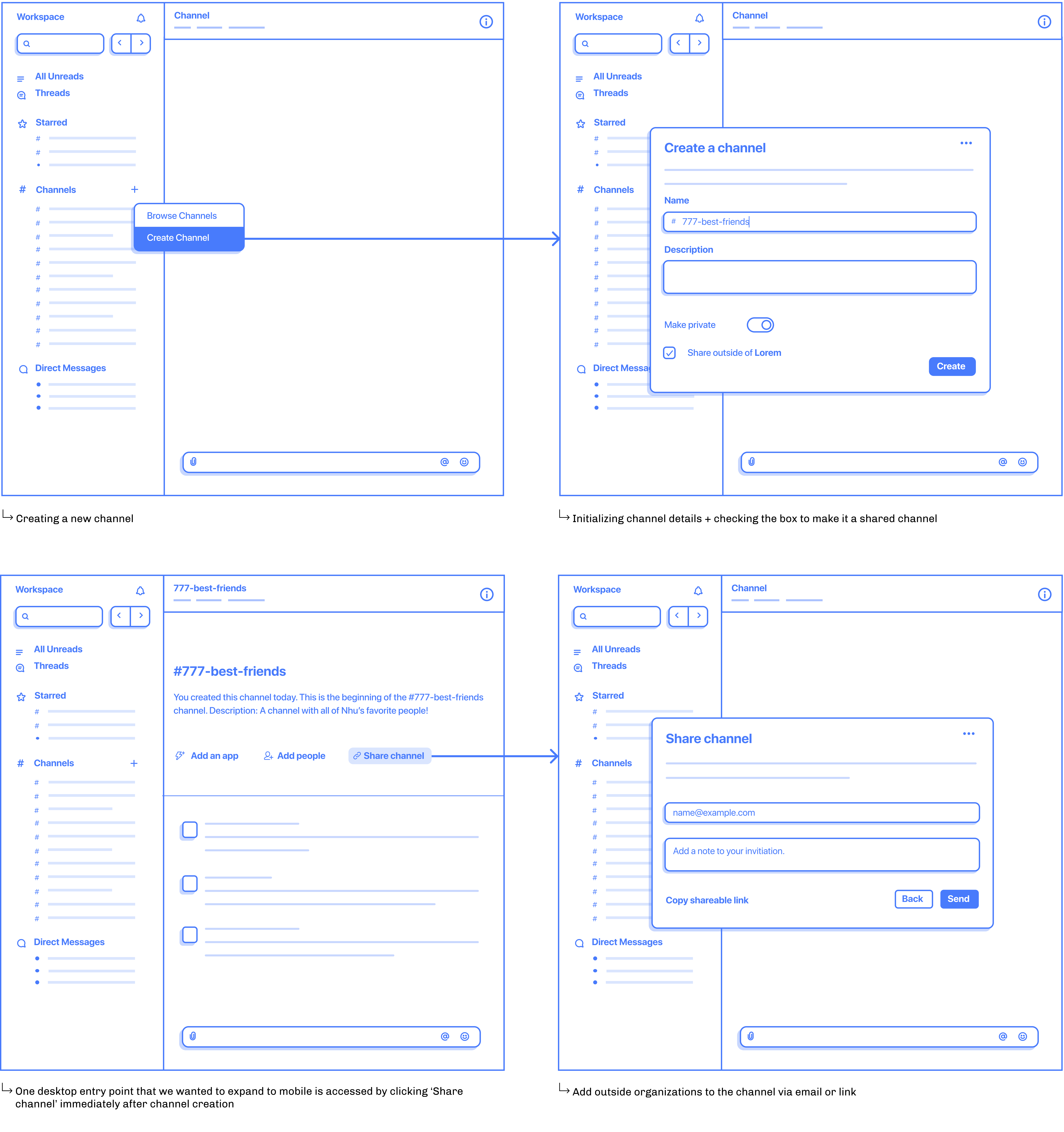
Today, users can create shared channels from our Desktop or Web experiences only. By unlocking mobile shared channel creation, we’re providing a more complete experience for our users that will also serve as a positive growth lever for accelerating the network.

[FIG 01] VISUALIZING SHARED CHANNELS
[FIG 02] UNDERSTANDING CURRENT UX

TAKEAWAYS
Because over 5k shared channels are made each week on the desktop version of Slack, how could we keep the entry points consistent so that the user experience on mobile is still familiar?
I also had to work in parallel with other teams working on the mobile designs, so there was a lot of collaboration in order to keep parity between all of the new features being developed!
[FIG 03] DESIGN ITERATIONS

[FIG 04] FINAL SCREENS

REFLECTION
From my first project at Slack, I learned a lot about the value of feedback and about the iterative design process. I also faced the new challenge of continuing a project that was already in progress, as it was passed onto me by my mentor! This really put into perspective the amount of collaboration that comes with working in the industry.

CHALLENGES
- Where can we place this user education?
- How can we make this feel helpful to a user rather than telling them to 'create a new channel' when it feels irrelevant?
- How do we avoid conflicts with existing education?
[FIG 05] PLACEMENT EXPLORATIONS

[FIG 06] DESIGN ITERATIONS + FINAL DESIGN
REFLECTION
My first beginning-to-end project at Slack was a definite challenge because of how open-ended it was. It was fun to explore so many different areas of placement, while also attempting to restrict myself to existing forms of user education so that users aren't overwhelmed throughout their workflow.

[FIG 07] UNDERSTANDING CURRENT UX

FINDINGS
In order to improve the current shared channel acceptance flow, I had to understand the dead-ends that users reach when trying to accept an invite. By outlining the process, it was a lot easier to grasp the pain points of the current system in place.
[FIG 08] ERROR STATES

FINDINGS
I learned that there are two distinct channel states when it comes to handling accepting an invite to a shared channel, and by distinguishing these states, we could better streamline the invite flow.
[FIG 09] DESIGN ITERATIONS + FEEDBACK

[FIG 10] FINAL SCREENS

REFLECTION
My whole time at Slack consisted of a great deal of trial and error, but I learned to be aware of the details and learn more about the effectiveness of human-centered design in facilitating the use of a product.